
Recently I have been doing some research on type classifications. Do you know how to classify a font? I have found it very fascinating to research because of how many characteristics there are. Type used to look very similar and therefore only had one classification, Old Style. Now we have five different ways to classify fonts. These are Old Style, Transitional, Sans Serif, Slab Serif and Modern.
Old Style fonts have very thick and thin strokes, contain a serif and are easy to read. They date back to 1465. An example of this classification is Sabon. Sabon is often used in books but not seen as much on the web, according to the blog, Type Wolf.

Transitional is another type classification. It is kind of similar to Old Style. Transitional fonts contain thick and thin strokes but they are more noticeable than in Old Style. They also contain serifs but those are not as noticeable. It is the most commonly used type classification as it can be used for many things. Times New Roman is an example of a Transitional font. Type Wolf says that, “The design [for Times New Roman] was based off [the font] Planton, but with a renewed focus on legibility and economy to better meet the needs of newspaper typography.

Sans Serif fonts are easy to notice because they are simply just fonts with out the serif. This type is usually only used for headlines. An example of this would be, Haüy. Haüy is one of the first Latin-alphabet sans serif typefaces. After reading some blogs on Types In Use, I discovered that Haüy was an attempt by Valentin Haüy at creating a Latin-alphabet writing system for the blind. “His approach was embossing simplified characters onto paper, which could be lightly inked to allow the sighted to read them also” (https://fontsinuse.com).
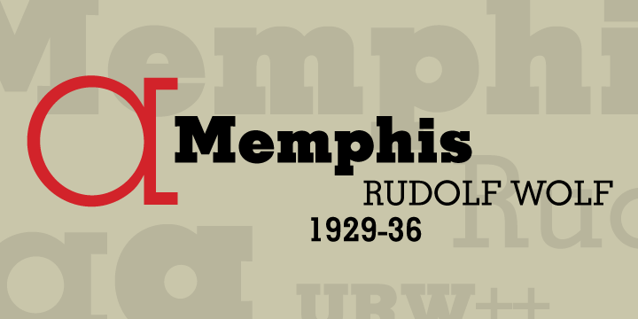
Slab Serif fonts are very bold and contain serifs. They have little to no contrast between the strokes and often look very rectangular. They are not used that often. An example of a slab serif font is, Memphis. Memphis is one of the earliest geometric slab fonts.
Modern fonts contain a lot of contrast between strokes. They vary from thin to thick. They also contain serifs that are very thin and long. This creates contrast against the heavy vertical lines. An example of a Modern font is, Bodoni. Bodoni was designed in 1798 and is often used for headings as it is harder to read when it is small. The blog, Fonts In Use show it used on many posters and albums.

All of these classifications can help us in identifying fonts when we see them and to know when to use a font. It is very useful to learn the characteristics of them all to be able to improve your skills as a designer. Can you classify fonts?
References:
fontsinuse.com
typewolf.com
friendsoftype.com
lorenamanhaes.com
rover.ebay.com
books.google.co.uk
urbanfonts.com
lynda.com
https://typelayoutbmcc.wordpress.com/type-classifications-terms/
