The goal of this project was to create a poster with a brochure on the back for the Speak Energy conference.
Concept Sketches
To start to develop ideas for my type cluster I created sketches based on the name “Speak Energy”.
Type Exploration
I experimented with a variety of fonts from neon styles to very simple sans serifs. I liked how the neon fonts represented the idea of energy, but found that the “y” was distracting ( see letter A). Eventually, I decided to use Gotham Narrow as my typeface because it is bold, simple, and eye catching.
Colour Application
The majority of my poster grey and white. I introduced a pop of green to add visual interest and also because the colour green is associated with renewable energy. I also experimented with using the colour blue to represent thermal energy but I found the intent of the poster was not as clear.
Final Layout
I generated several different layout concepts but eventually decided that the simplest approach was the best. I decided to go with this layout because it guides the viewer’s eyes through the poster nicely and puts all emphasis on the name of the conference.
First DraftsFinal PosterFinal Brochure
Overall, I think my poster and brochure were successful. I enjoyed seeing all of my ideas come to life and improve as I made adjustments. I think the final product is simple yet effective in promoting the Speak Energy Conference.
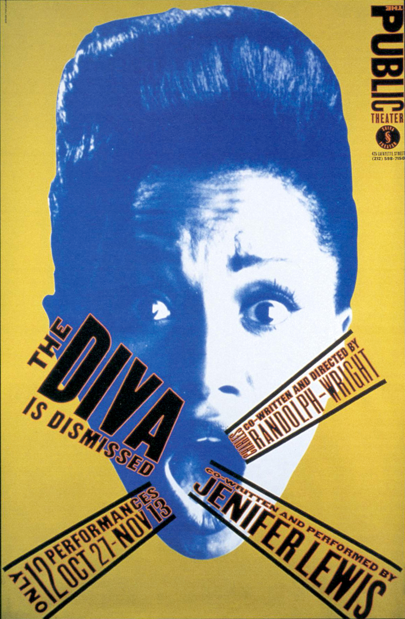
It was made to advertise for the play, The Diva is Dismissed. It is supposed to catch people’s attention and make them intrigued in the play so that they will go see it.
I selected this poster to analyze because I really enjoy how dynamic it is. The words almost look like they are popping right off of the poster. It makes it stand out and catch people’s attention. It also has a very interesting colour scheme. I would never think to put blue, red and the yellow-brown together, but somehow she makes them all work and unite.
This poster has a very good text hierarchy. The title stands out the most, then the main actor, followed by the director and a “now playing” text frame. This hierarchy is done by making the title and main actor in bold, and in larger text and then making the less important text in a condensed font and smaller. Another thing this poster does well is demonstrating a very interesting and unique layout. There is many diagonals coming from different directions which makes our eyes drawn to it.
This poster does not commit any of the 34 typographic sins, though it does commit a big design sin. It has a red stroke around the black letters. This makes it harder to read, especially when the letters get smaller.
This poster has inspired me to be more bold when creating a layout for my posters. I usually shy away from using a lot of diagonals but this poster makes them work very well.
Recently I have been doing some research on type classifications. Do you know how to classify a font? I have found it very fascinating to research because of how many characteristics there are. Type used to look very similar and therefore only had one classification, Old Style. Now we have five different ways to classify fonts. These are Old Style, Transitional, Sans Serif, Slab Serif and Modern.
Old Style fonts have very thick and thin strokes, contain a serif and are easy to read. They date back to 1465. An example of this classification is Sabon. Sabon is often used in books but not seen as much on the web, according to the blog, Type Wolf.
lorenamanhaes.com
Transitional is another type classification. It is kind of similar to Old Style. Transitional fonts contain thick and thin strokes but they are more noticeable than in Old Style. They also contain serifs but those are not as noticeable. It is the most commonly used type classification as it can be used for many things. Times New Roman is an example of a Transitional font. Type Wolf says that, “The design [for Times New Roman] was based off [the font] Planton, but with a renewed focus on legibility and economy to better meet the needs of newspaper typography.
rover.ebay.com
Sans Serif fonts are easy to notice because they are simply just fonts with out the serif. This type is usually only used for headlines. An example of this would be, Haüy. Haüy is one of the first Latin-alphabet sans serif typefaces. After reading some blogs on Types In Use, I discovered that Haüy was an attempt by Valentin Haüy at creating a Latin-alphabet writing system for the blind. “His approach was embossing simplified characters onto paper, which could be lightly inked to allow the sighted to read them also” (https://fontsinuse.com).
books.google.co.uk
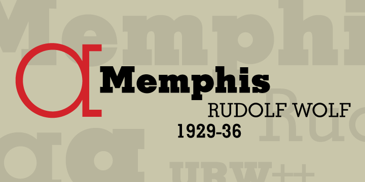
Slab Serif fonts are very bold and contain serifs. They have little to no contrast between the strokes and often look very rectangular. They are not used that often. An example of a slab serif font is, Memphis. Memphis is one of the earliest geometric slab fonts.
urbanfonts.com
Modern fonts contain a lot of contrast between strokes. They vary from thin to thick. They also contain serifs that are very thin and long. This creates contrast against the heavy vertical lines. An example of a Modern font is, Bodoni. Bodoni was designed in 1798 and is often used for headings as it is harder to read when it is small. The blog, Fonts In Use show it used on many posters and albums.
fontsinuse.com
All of these classifications can help us in identifying fonts when we see them and to know when to use a font. It is very useful to learn the characteristics of them all to be able to improve your skills as a designer. Can you classify fonts?
I found three very interesting typography blogs that helped me get inspiration for my blog. These include: http://friendsoftype.com, https://www.typewolf.com, and https://fontsinuse.com. All of these blogs share photos and information about different typefaces. They are all very helpful for designers who are looking for inspiration on typography. I find all the blogs very engaging and useful.
Friends of Type is a blog where designers can share their typography designs and sketches. Each month a new designer is featured to help inspire other designers. It features mostly hand lettering which makes it very original and creative. The website itself has very bright colours and is very appealing to the eye. It also features a section where you can buy merchandise with other artist’s typography work on it. This way artists can support other artists.
Type Wolf features many fonts for designers to pick from for their projects. It shows the actual fonts as well as demonstrates them on websites to show how they will look while in use. It also shares background information on all of the fonts and recommends you fonts that are similar. If you are just getting into typography you can go on this blog and get resources on typography to learn more about fonts and how to pair them together.
Fonts In Use is a blog that shows fonts being used on actual things such as books and websites. It helps designers get a sense of what kind of mood the font gives off. Seeing the fonts in use helps give inspiration to other artists and give ideas on when to use what font. It also features many vintage fonts and gives a brief bit of history about them.
Conclusion
All of these blogs are very helpful for designers who need ideas on what fonts to use. They all have very creative typefaces and share plenty of information about typography. If someone is ever stuck on what font to use for a certain project they could easily just check out any of these blogs and find something to use. To make my blog as engaging as them I will be sure to use lots of visuals and provide interesting information that people will want to read. I want my blog to look visually appealing and include a lot of facts about typography.